
What Is Responsive Web Design? And How to Get Started
Introduction to Responsive Web Design
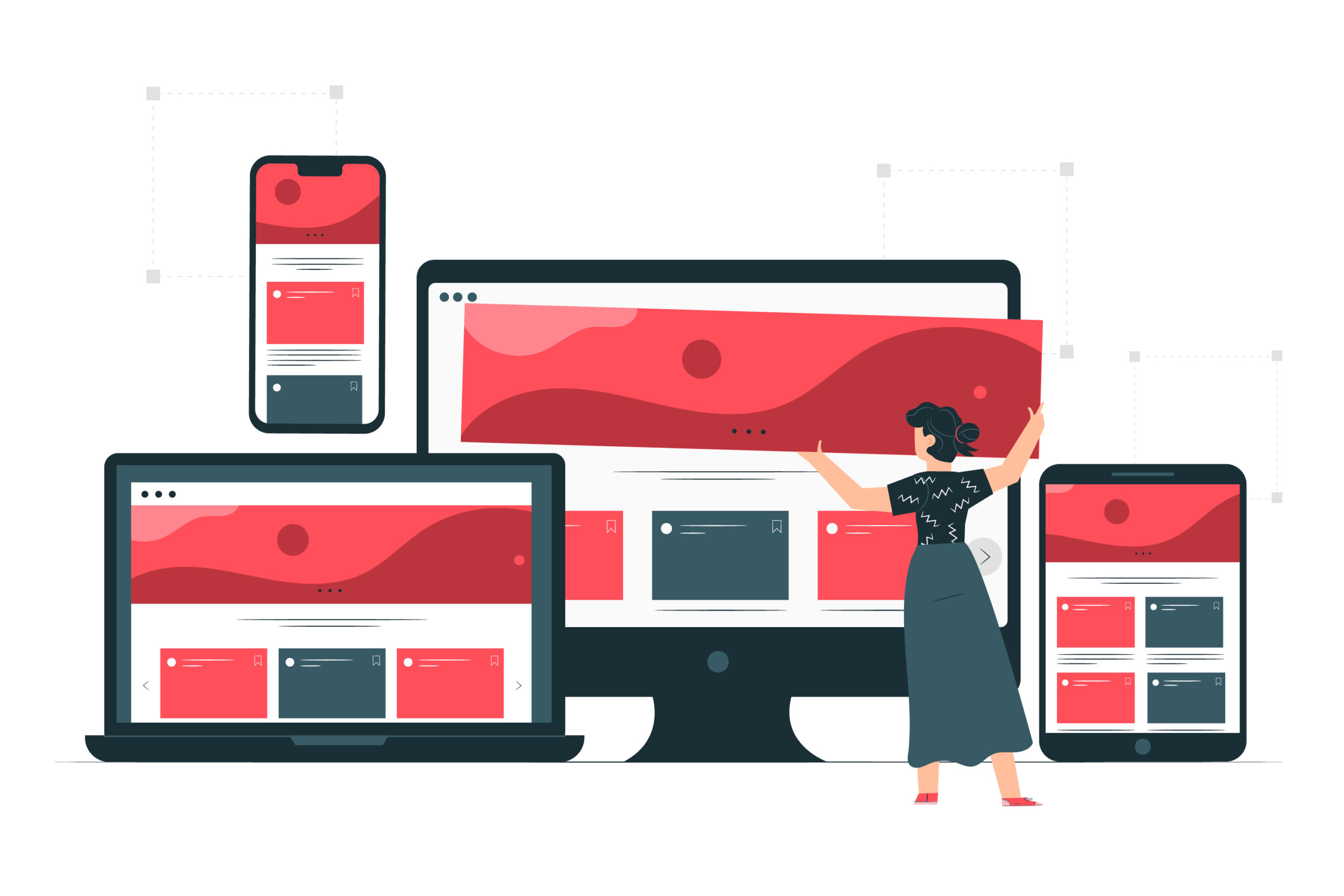
What is responsive web design?
Responsive web design is a game-changer in the digital world. It’s a design philosophy that aims to make websites adaptable and user-friendly across various devices. In simpler terms, it ensures that your website looks and works well whether your audience is on a large desktop screen, a tablet, or a smartphone.
But why is this important? Think about how you surf the web. You might use your desktop computer at work, your tablet on the couch, and your smartphone while waiting for your coffee. Responsive design ensures that your website adapts seamlessly to all these scenarios.
Importance of responsive web design in the modern digital landscape
The digital landscape today is incredibly diverse. People are no longer tethered to desktops; they’re on the move, and they want information at their fingertips. Here’s why responsive web design matters:
– Improved User Experience: Have you ever visited a website on your phone where you had to pinch and zoom just to read the text? That’s what responsive design prevents. It ensures that your users can navigate your site easily, no matter what device they’re using.
– Broad Accessibility: People use all sorts of devices to access the internet – from the latest iPhone to a budget Android phone or even an older laptop. Responsive design makes sure your site is accessible to everyone.
– SEO Benefits: Search engines like Google appreciate responsive design. They want to provide the best results for their users, and a mobile-friendly site is seen as a positive ranking factor.
-Future-Proofing: As new devices hit the market, you won’t need to redo your website each time. Responsive design ensures your site is ready for whatever comes next.
Understanding it’s Core Concepts
- Fluid grids and flexible layouts:
Imagine your website’s layout as a set of flexible building blocks. On a large screen, these blocks might spread out, but on a smaller screen, they’ll stack neatly. This fluidity is thanks to fluid grids. They ensure that your content flows harmoniously, regardless of screen size. - Media queries and breakpoints:
Media queries are like instructions for your website. They say, “Hey, if the screen is this size, do this.” Breakpoints are the specific screen sizes where these instructions kick in. For example, you might have one layout for screens larger than 1200 pixels and another for screens between 768 and 1199 pixels. - Mobile-first approach:
Building on fluid grids and media queries, the mobile-first approach suggests designing for the smallest screens first and then progressively enhancing for larger ones. It ensures that the most essential content is prioritized for mobile users, where space is limited. - Adaptive vs. responsive design:
Responsive design, as we’ve discussed, involves flexible layouts that adapt to different screens. Adaptive design, on the other hand, involves creating distinct layouts for various devices. While both have their merits, responsive design is favored for its versatility and future-proofing.
Key Principles for Responsive Web Design
- Content prioritization:
When space is limited, every pixel counts. Responsive design encourages you to think critically about what content is most important and should be prominently displayed on smaller screens. This ensures that users get the essential information without excessive scrolling or tapping. - Scalable images and media:
Images and media play a significant role in web design. They need to be scalable to look good on all devices while still maintaining fast loading times. Techniques like responsive images and lazy loading help strike this balance. - Optimal typography:
Typography affects how users perceive your content. In responsive design, you need to consider not only the font size but also line spacing and readability on smaller screens. - Touch-friendly elements:
Many users interact with websites via touchscreens. Buttons, links, and interactive elements must be large enough to tap accurately without accidentally clicking on neighboring elements. - Cross-browser compatibility:
Responsive design isn’t just about different screen sizes; it’s also about ensuring your website functions smoothly across various web browsers, including Chrome, Firefox, Safari, and Internet Explorer.
Planning Your Responsive Design Project
- Conducting audience research:
Understanding your audience’s device preferences and behaviors is crucial. You might find that a significant portion of your users accesses your site via mobile, guiding your design decisions. - Defining device breakpoints:
Breakpoints are a fundamental aspect of responsive design. Carefully defining your breakpoints ensures that your design transitions smoothly between different screen sizes. - Wireframing and prototyping your layout:
Before diving into design, it’s often beneficial to create wireframes and prototypes. These visual blueprints help you visualize how your design will adapt to various screens. - Choosing the right design tools:
The digital toolbox for designers is vast. From graphic design software like Adobe XD and Sketch to web design frameworks like Bootstrap and Foundation, selecting the right tools can streamline your responsive design project.
Implementing Responsive Design Techniques
- Building a responsive grid system:
Grid systems are the backbone of web layout. In responsive design, you’ll create grids that automatically adjust to different screen sizes, maintaining the structure and aesthetics of your site. - Applying media queries effectively:
Writing media queries effectively requires understanding your design’s breakpoints and using CSS rules to adapt the layout and content accordingly. - Handling navigation menus and forms:
Navigation menus and forms are vital interactive elements on websites. Ensuring they work seamlessly across devices is essential for a smooth user experience. - Incorporating CSS frameworks and libraries:
CSS frameworks and libraries, such as Bootstrap and jQuery, offer pre-built components and functionalities that can significantly expedite the responsive design process.
Tips for Optimizing Responsive Web Design
- Performance optimization strategies:
Optimizing performance is crucial for responsive design. Techniques like code minification, browser caching, and content delivery networks (CDNs) can help improve load times. - Image optimization for different devices:
Images often contribute to a significant portion of a webpage’s file size. Optimizing images for various devices can strike a balance between quality and performance. - Keeping navigation intuitive on smaller screens:
On smaller screens, it’s essential to simplify navigation while retaining essential features. Consider mobile-friendly navigation patterns like hamburger menus.
Speeding up load times
Fast load times are a hallmark of a well-optimized website. Strategies like asynchronous loading of scripts and reducing server response times contribute to snappy performance.
Best Practices for Responsive Web Design
- Consistency in design across devices:
Maintaining a consistent brand identity and design language across all screen sizes ensures a cohesive and professional appearance. - Creating a seamless user experience:
User experience should be seamless, regardless of the device. Transitions between breakpoints should be smooth, and user interactions should feel intuitive. - Accessibility considerations for responsive sites:
Accessibility is critical. Ensure your design complies with web accessibility standards, making your site usable by individuals with disabilities.
Choosing the right tool for your project
The choice of design tool can significantly impact your workflow. Factors like project complexity, team collaboration, and your familiarity with the tool should guide your decision.
When it comes to digital success, selecting the perfect SEO tools is crucial. These powerful aids can make or break your project. Find the ideal SEO tools that match your unique project requirements, ensuring efficient performance and optimal results. Don’t underestimate the impact of the right tools on your SEO journey.
Exploring responsive design plugins and libraries:
Plugins and libraries can extend the functionality of your responsive design, offering pre-built solutions for common design challenges.
Future Trends in Responsive Web Design
- The impact of emerging technologies:
Keep an eye on emerging technologies like augmented reality (AR), virtual reality (VR), and voice interfaces. These innovations may influence how responsive design evolves. - Evolution of responsive design approaches:
Responsive design continually evolves. Stay informed about evolving methodologies and best practices to keep your websites at the forefront of user experience.
Key Takeaways
In summary, responsive web design is a dynamic approach that ensures your website adapts gracefully to diverse screens and devices. Key takeaways include understanding fluid grids, utilizing media queries, prioritizing content, and optimizing for performance.
FAQs
- What is the difference between adaptive and responsive design?
Responsive design employs a single layout that adapts to various screen sizes, while adaptive design uses distinct layouts for different devices. - Can any website be made responsive?
Most websites can be made responsive with proper design and development techniques. However, highly complex applications may require more specialized approaches. - How can I deal with responsive design challenges?
Understanding responsive design principles and conducting thorough testing are essential for overcoming challenges and creating a successful responsive site. - Are there any SEO implications for responsive web design?
Responsive design is favored by search engines because it offers a consistent user experience across devices. A mobile-friendly website can positively affect your SEO rankings.
Responsive web design is a multifaceted approach that caters to the diverse digital landscape we navigate daily. It ensures that your website provides an exceptional user experience, regardless of the device used. By understanding its core concepts, implementing best practices, and staying attuned to emerging trends, you can create web experiences that are not only visually appealing but also highly functional, accessible, and future-proof.

![6 Best Free Website Builders to Check Out in 2023 [+Pros & Cons]](https://marketscrawl.com/wp-content/uploads/2023/11/construction-building-architecture-concept-1-1-768x558.jpg)